by Naomi Vettath
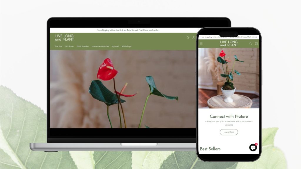
PROJECT OVERVIEW
Live Long and Plant is a plant-centered lifestyle brand dedicated to providing customers with the ultimate plant ownership experience. The website’s current layout lacks coherence, resulting in scattered information that doesn’t align with the goal of brand awareness. Additionally, the visual design doesn’t reflect the values of freshness, joy, and minimalist aesthetics. The goal for this redesign is to enhance brand awareness for Live Long and Plant and facilitate easier access to their core offerings.
THE CHALLENGE
How might we create a clear, informative, and joyful website that resonates with our plant-loving customers?
UNDERSTANDING THE PROBLEMS & DEFINING SOLUTIONS
DESIGN GOALS
- Improve Information Accessibility: Help visitors easily find and engage with Live Long and Plant’s brand story and product information.
- Enhance Engagement with Compelling Content: Keep all visitors engaged by showcasing meaningful stories across all sites, including product pages, blogs, and events.
- Align Visuals with Brand Image: Ensure that the website’ visual design reflects the brand’s values of minimalist aesthetics, brightness, and vibrancy.
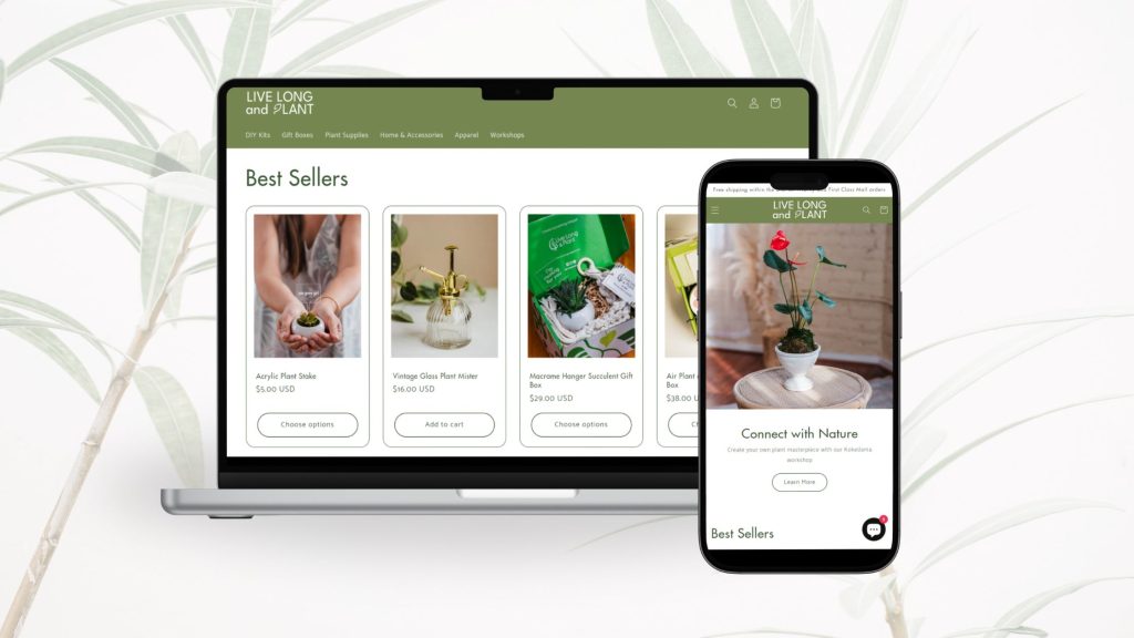
SOLUTIONS
- Revised Navigation Structure: We will simplify the navigation menu to make it more intuitive and user-friendly. This includes reorganizing categories and ensuring that visitors can easily find what they’re looking for.
- Enhanced Visuals: Our redesign will focus on refreshing the website’s visual elements to align with the brand’s values of freshness, joy, and minimalist aesthetics. This will involve updating imagery, color schemes, and overall design to create a more visually appealing and cohesive experience.
- Improved Content Organization: We’ll streamline the content structure to ensure that brand information, product details, and engaging stories are all presented in a clear and organized manner. This will make it easier for visitors to explore and engage with the website.
MARKET RESEARCH & USER PERSONA
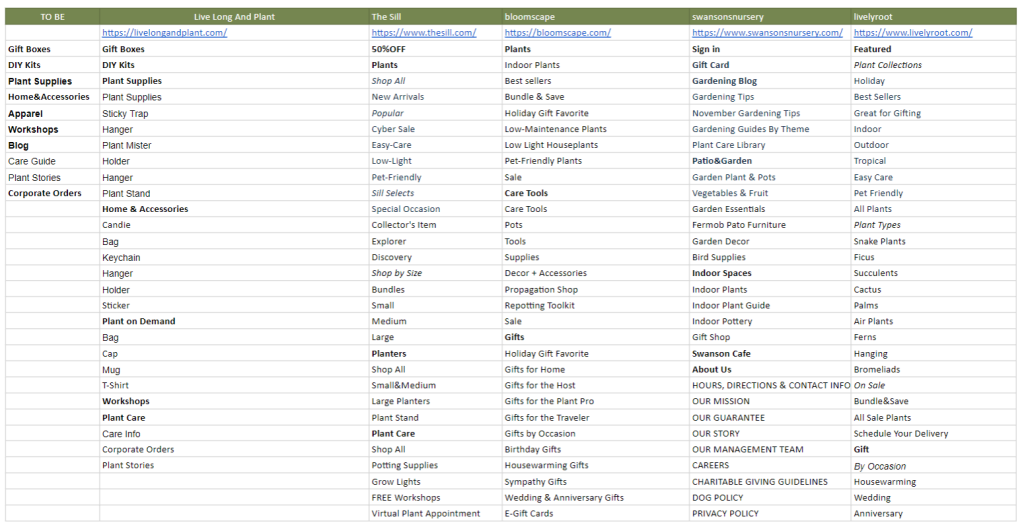
COMPETITOR ANALYSIS
Competitor analysis allows us to understand industry standards and identify best practices that can be applied to our website redesign. By evaluating competitors, we can pinpoint areas for improvement and ensure that Live Long and Plant stands out in the market.
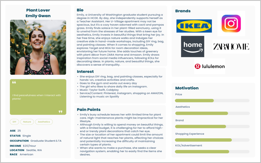
USER PERSONA
Creating personas helps us gain a deeper understanding of our target audience’s needs, preferences, and behaviors. By developing these detailed user profiles, we can design a website that effectively addresses user expectations and enhances their overall experience with Live Long and Plant.
IDENTIFYING BRAND STYLE
MOODBOARD & COLOR
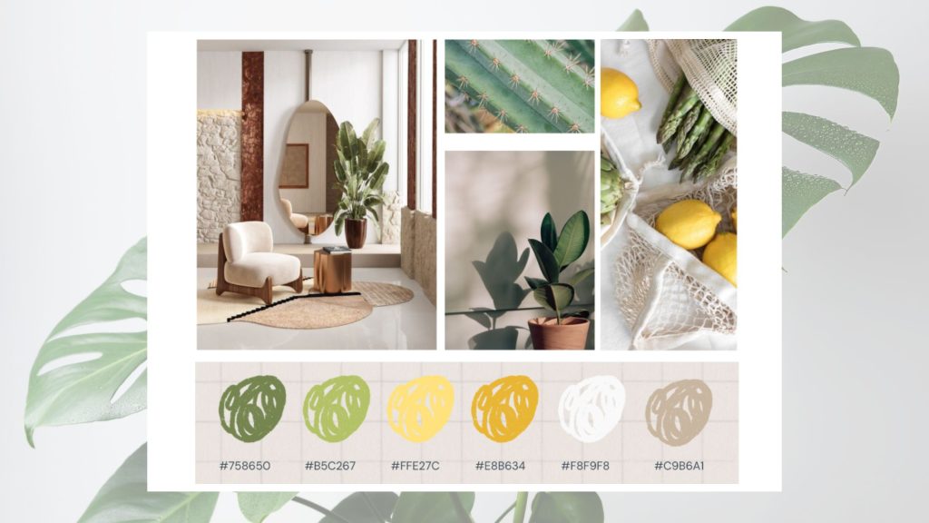
A mood board helps us visually capture the desired atmosphere and emotional tone for the website redesign, ensuring that the design aligns with the brand’s values. By evoking a sense of comfort, relaxation, artistic freshness, leisure, warmth, and everyday simplicity, we can create a cohesive and inviting user experience for Live Long and Plant.
LOGO DESIGN
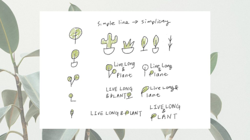
Logo brainstorming for Live Long and Plant focuses on simplicity and modernity, aiming to create a clean, contemporary design that embodies the brand’s essence.
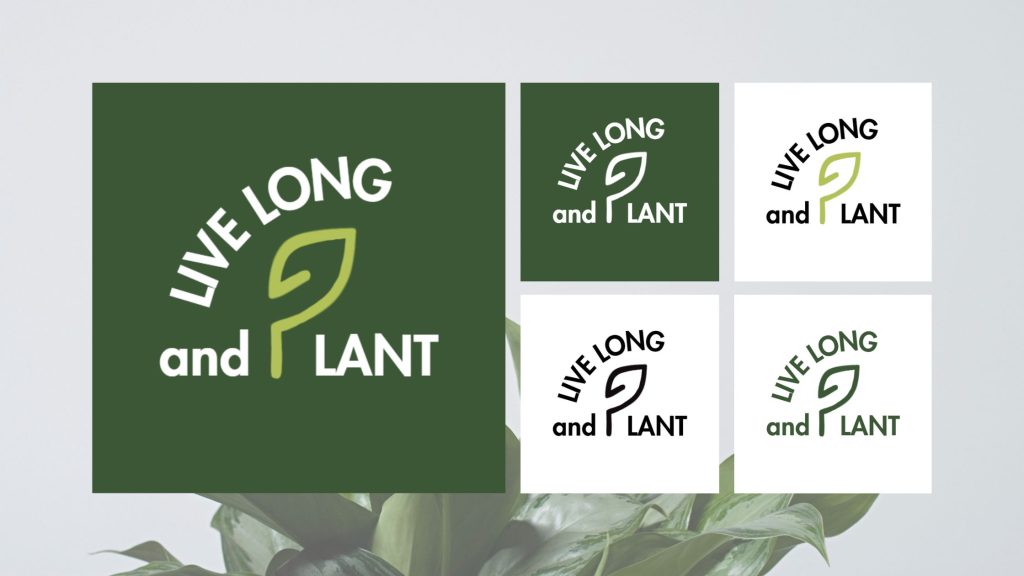
Final Logo Variations
WEBSITE REDESIGN
SITE MAP
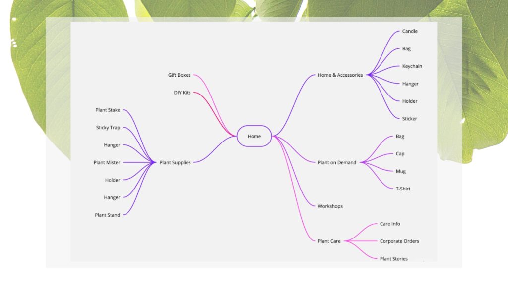
Drafting the site map involves creating a clear information architecture that organizes content efficiently, ensuring an intuitive and seamless user experience.
PROTOTYPES
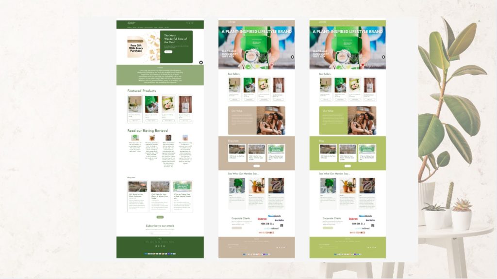
Prototypes were created to test and iterate designs, ensuring the final user interface for Live Long and Plant is both seamless and engaging.
USABILITY TESTS
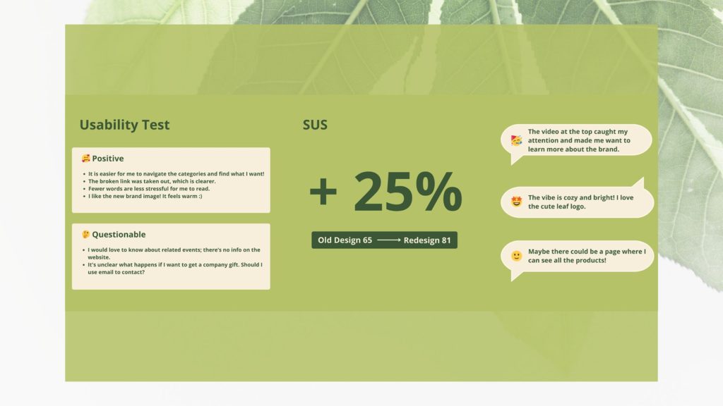
User testing, including the use of the System Usability Scale, is conducted to measure and enhance user satisfaction; in this project, we saw a 25% increase in user satisfaction.
FINAL WEBSITE REDESIGN
The final prototype represents the refined and optimized design, incorporating feedback and ensuring a user-friendly experience for Live Long and Plant.
VOLUNTEER REFLECTION

The part I enjoy the most is assisting in rebranding, from brainstorming ideas and sketching concepts to refining the final color palette and logo design. Understanding the vibe our brand aims to convey to our customers is crucial. Ellise not only grants me the freedom to explore and experiment but also attentively considers user feedback, ensuring a remarkably smooth process. Witnessing her dedication to infusing her passion for plants into every aspect of her work is truly inspiring, and I am thrilled to infuse that same level of energy into our projects.
Milly Liu, Cohort 2023, MCDM

 University of Washington